
01
PLANNING
Before getting into the semester properly, I spent some time reading and thinking through so I could understand what is expected and what means for the way I'll be working in the next few weeks.
Based on my experience with previous semesters, I know I can lose direction when a project becomes complex, so I set up a simple weekly framework to keep the work steady and manageable from the start.
RESULT & REFLECTION
WEEKLY WORKING STRUCTURE
(BASED ON THEMATIC CODING)
02
RESEARCH & ANALYSIS
For research this week, I did not rush into academic readings. I started by exploring case studies and other designers’ project processes to rebuild motivation.
I wanted to know how an idea is generated and developed from day one, and how its potential evolves over time.
👩💻 I focused mainly on conducting case studies. Most of them I looked at are large, fully realised projects.
While they are polished outcomes, they still serve one clear purpose for me: showing how an idea is developed, refined, and scaled over time. By reading them backwards and forwards, I could trace decisions, shifts, and priorities.

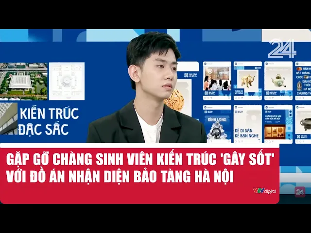
Project by
/Duong Duc Anh
Type of project
/Hanoi Museum Rebrand
Specialism
/Visual Identity
/Brand Design
/Typeface Design
This project is a well-known graduation work that was later recognised and adopted by the Hanoi Museum.
I chose this project because its design research is solid and well-structured. I wanted to understand how research actually matters and shapes the ideation process.

[CASE STUDY 1] READING MATERIALS & ANALYSIS
*DESIGN STATEMENT
In one of the interviews, he stated that implementing cultural materials into design has become a common trend. Because of this, he wanted to try out this concept and chose it for the project, as it allowed space for cultural integration to be explored through design.
✍️ This is why the project was chosen - to create enough space for cultural elements to be explored.
*DESIGN CHALLENGES
He pointed out that the main challenge was finding the balance between cultural depth and modern expression. The design needed to carry a cultural soul, but without letting the modern or subjective layer take over.
✍️ Balancing cultural meaning with modern design without one overpowering the other.

*DESIGN APPROACH
When asked about his stylisation approach, he talked about his background studying architecture in Hanoi.
His strong attachment to the city led him to integrate architectural elements of Hanoi into the identity system. Visual references such as temple roofs, Old Quarter windows, and iconic symbols like Khue Van Các were abstracted and translated into horizontal strokes within the letterforms.
✍️ Hanoi architecture was abstracted into typographic details to embed cultural identity into the visual system.

*DESIGN INSPIRATION
I found that the project first gained attention after being shared widely on social media, but it was not designed for attention from the start. It came from a genuine concern about the museum and its identity.
✍️ The project started from a real problem.
*DESIGN PROBLEM
His research began with a visit to the Hanoi Museum. The architecture itself triggered the main question, especially the contrast between its strong symbolic form and the lack of a clear visual identity.
✍️ Physical space and architecture can be a research trigger.
*RESEARCH QUESTION
From related articles, I identified his research question around why a cultural institution like the Hanoi Museum, despite preserving the city’s heritage, lacked a brand identity strong enough to connect with the community, especially younger audiences.
✍️ The research question directly informed how design research was structured and applied throughout the project.


*DESIGN RESEARCH
Instead of designing immediately, he spent the first month only on research, reading historical materials and learning about the museum’s cultural background.
✍️ Strong design research takes time and cannot be rushed into visuals if cultural depth is the goal.
Among the cultural references, Khuê Văn Các emerged as a key inspiration, seen as both a historical symbol of Hanoi’s scholastic tradition and a personal memory for the designer.
✍️ Cultural references work better when they are deeply understood.
Color choices were also informed by local cultural artefacts such as Bat Trang ceramics, the colors of Ho Guom and Ho Tay, and familiar street sign palettes.
✍️ Research can guide even small visual decisions like colour.
👩💻 After getting more familiar with design research, I started paying attention to how outcomes are presented.
This approach became the starting point for Case Study 2, where the emphasis moves from final results to tracing development step by step. Instead of focusing on how finished these projects look, I started paying more attention to how their ideas unfold over time.


Project by
/Phu PT
Type of project
/Freshii Brand Identity
Specialism
/Visual Identity
/Brand Design
/Packaging Design
This project is more outcome-focused and closer to a typical graduation project, which aligns with the next phase of this semester.
I still chose to study this project because I wanted a clearer sense of what different final outcomes could look like, and how projects with similar scopes are visually resolved. Another reason was his vlog documentation, which offered useful insights into feedback gathering and iteration from a previous student’s experience.
[CASE STUDY 2] READING MATERIALS & ANALYSIS

*DESIGN STATEMENT
From the vlog, it was clear that this project was not the initial idea from the beginning. The concept was gradually rebuilt and re-ideated through feedback, revisions, and trial-and-error during the process.
✍️ A brand idea can be reshaped through iteration, and it's necessary.
*DESIGN CHALLENGES
A lot of tension came from balancing ambition with reality. He wanted to do motion but switched to branding due to time and workload.
Later challenges included making the brand look like tea vibe and not juice, ensuring materials looked correct, and responding to critiques about realism in Vietnamese context.
✍️ Most challenges came from balancing concept, category cues, and academic expectations.


*DESIGN APPROACH
Throughout the process, feedback and academic reviews became the main drivers. Weekly supervision, three formal review rounds, and repeated critiques led to constant revisions, discarded work, and reworked outcomes. Prototyping, printing, and testing were used to respond to critique and adjust direction, making the process strongly feedback-driven under time and institutional constraints.
✍️ This is a feedback-driven approach where concepts evolve through iteration.

*DESIGN INSPIRATION
Instead of referencing specific brands, the inspiration came from kombucha itself.
The sound, fermentation, health benefits, and youth lifestyle all fed into naming, patterns, and visuals. The idea of translating sound (“shii”) into wave patterns was especially important in shaping the system.
✍️ Sensory and linguistic aspects can become strong branding foundations.
*DESIGN PROBLEM
The designer was unfamiliar with kombucha at first, so the challenge started with understanding what the product actually is and how it should look.
At the same time, the project had to meet strict academic requirements across multiple review rounds, which influenced how the design evolved.
✍️ Design problems here are both product-based and institution-driven.
*RESEARCH QUESTION
Although not stated directly, the project keeps circling around how a kombucha brand can feel healthy and tea-based while still looking youthful and visually striking. Most iterations and feedback point back to this same question.
✍️ A research question can be guided yet remaining unchanged.


*DESIGN RESEARCH
Another thing I noticed is that research here was selective. He did not aim to understand everything about kombucha or branding, but focused only on what was necessary to move the project forward at each stage.
✍️ Research depth can be strategic or situational.
The research process was fragmented. Different types of research appeared at different moments: product understanding early on, communication research when slogans were questioned, material research when renders were criticised, and usage research when scenarios felt unrealistic.
✍️ Design research can shift focus multiple times within the same project.
Lastly, this case made me realise that research outcomes do not always look like insights or data. Sometimes research only results in clearer boundaries: what the project should not look like, or what direction should be avoided.
✍️ Design research can be about narrowing possibilities.
RESULT & REFLECTION
After conducting two case studies, I was able to extract and compare the design research workflows behind each project.
👩💻 The section below focuses on Case Study 1, breaking down how its research-led workflow was structured. Insights are formed before visual decisions are made.
This workflow is research-led. Contextual research and analysis are used to extract key insights, which then inform the research question and guide the design direction. Visual outcomes are treated as translations of research.

👩💻 The section below focuses on Case Study 2, breaking down how its design-led workflow was structured. Early design attempts are used as a way to test ideas and surface issues before insights are fully defined.
This workflow is design-led. Design comes before research, and feedback helps point out problems. These problems then lead to more focused research, which helps improve and adjust the design step by step.

03
PRACTICES & DEVELOPMENT
Most of this week focused on in-class activities. The lecturers guided us through the early steps of building a website, mainly introducing different website builder options and how they could support a process-based workflow.
👩💻 This week’s workshop introduced the new submission format: the Process Journal. So our in-class session introduced the Process Journal format and clarified what needs to be documented this semester.
We were guided through what the journal should include, from documenting ideas and research to recording experiments and weekly development, focusing on showing how the process evolves. The workshop also introduced the format and different website builders that can be used to document the process over time.


*PROCESS JOURNAL
This workshop introduced the Process Journal as the main submission format. I learned that it focuses on documenting ideas, research, experiments, and skills development over time.
✍️ The Process Journal is another high-quality version of a sketch-book.
*WEB BUILDER
We were also introduced to different website builders, which are tools used to build and organise the Process Journal online. Choosing the right web builder is important because it affects how clearly the process, weekly progress, and experiments can be structured and presented.
✍️ The right web builder helps make the learning process clear and easy to follow.
[WEB BUILDER #1] CARGO SITE

*PROS & CONS
Cargo is well-suited for design students. It offers many visual templates, allows custom CSS, and gives flexibility in layout, which is useful for presenting experimental and process-based work.
However, it has limited tutorials and weaker cross-device responsiveness, which can make setup and optimisation more challenging, especially without prior experience.
✍️ Cargo offers strong visual freedom but requires more self-learning and testing.
*USABILITY
From the workshop, it was clear that Cargo works best for documenting process. It supports image-led layouts and experimentation, but requires careful planning to keep content readable and structured.
✍️ Cargo is suitable for process journals, but usability depends heavily on how the layout is organised.


*INTERACTIVITY
This web builder supports a non-linear way of viewing content, allowing projects to be explored through scrolling, sections, and embedded links.
✍️ The builder encourages exploration, making the documenting process more engaging.

*CODING SUPPORT
Cargo offers limited but flexible coding support, mainly through CSS adjustments. This allows the creator to tweak layout, spacing, and interactions without fully relying on templates, while still keeping the build manageable.
✍️ Light coding support gives enough control to personalise structure without over-complicating the workflow.
[WEB BUILDER #2] READYMAG

*PROS & CONS
Readymag is beginner-friendly and easy to pick up, even for users with no prior web-building experience. Its drag-and-drop system, clear layout structure, and built-in interactions make it straightforward to start publishing a Process Journal without touching code.
However, limitations appear when scaling up. The free plan restricts page numbers, and the pricing becomes expensive for long-term or content-heavy projects, which may affect feasibility over time.
✍️ Readymag is accessible for beginners, but less flexible for large or long projects.
*USABILITY
From the workshop, Readymag stood out as an approachable tool for documenting process online. The interface is intuitive, allowing quick layout building and easy updates, which suits weekly journal submissions and iterative work.
✍️ Readymag is easy to start with, but structure becomes critical as content increases.


*INTERACTIVITY
Readymag allows for flexible and layered navigation, where content can be organised in sections, horizontal or vertical flows, and linked blocks. This makes it possible to browse different parts of a Process Journal without scrolling strictly top to bottom.
✍️ Readymag’s interactive layouts help viewers move between entries in a more engaging and flexible way.

*CODING SUPPORT
Readymag is primarily a no-code builder, with limited support for deeper customisation. It provides easy editing tools that let you adjust layout and visual elements without writing code, which suits beginners. However, this also means less flexibility for advanced tweaks if needed.
✍️ No coding support keeps the workflow simple but limits advanced customisation.
[WEB BUILDER #3] FRAMER

*PROS & CONS
Framer feels more advanced compared to Cargo and Readymag. It allows stronger control over layout, responsiveness, and interaction, especially for larger or more complex projects. The built-in CMS and component system make it suitable for scaling a Process Journal over time.
However, the learning curve is steeper. Framer requires more time to understand its structure, logic, and interaction settings, which may feel overwhelming for beginners at the start.
✍️ Framer is powerful and scalable, but requires more time and commitment to learn.
*USABILITY
It was clear that Framer works well for organising long-term and content-heavy Process Journals. It supports clear page structures, reusable components, and responsive layouts across devices, making navigation more consistent.
✍️ Framer is suitable for structured and long-term documentation, as long as the layout is planned carefully.


*INTERACTIVITY
Framer supports interaction through components, animations, and scroll-based effects. Pages can include hover states, transitions, and micro-interactions that help guide users through content in a more dynamic way.
✍️ Framer allows interactions to support interactive elements and flow.
*CODING SUPPORT
Framer offers optional coding support through components and logic, but it is not required to start building. Most layouts and interactions can be created visually, while more advanced users can extend control when needed.
✍️ Advanced and real-time coding support available.
RESULT & REFLECTION
I tried both Cargo and Framer too see whether website builder suits me the most.
👩💻 I followed the tutorial during the workshop and tried building the Process Journal using Cargo. However, I found it quite difficult to use at first. The interface felt unfamiliar, and some basic actions took longer than expected when I was just trying to document my work quickly.
Since I already have experience working with grid systems and layout logic in WordPress, Cargo felt less intuitive to me. Some functions were limited without student access, so I could not fully explore its flexibility. I think I need more time and the student code to properly test whether Cargo fits my workflow.


👩💻 I then tried building the Process Journal using Framer. Compared to Cargo, Framer felt more approachable from the start. The layout tools, breakpoints, and pre-structured components made it easier to set up pages quickly and see how content would adapt across screens.
Because Framer already provides clear layout systems and visual guides, I felt more comfortable organising text, images, and sections without overthinking the structure. It suits the way I usually work, especially when I want to focus on documenting process rather than struggling with setup. At this stage, Framer feels more aligned with my workflow.

👩💻 I explored Framer further and followed several tutorials provided on the platform. Framer offers a wide range of learning resources and ready-made code examples, which made it easier for me to test interactions and basic components without starting from scratch.
Having access to clear tutorials and existing code bases helped me understand how things work more quickly. I was able to follow the steps and successfully build small interactive elements, which gave me more confidence using Framer and reinforced that it is a practical tool for developing my Process Journal.

